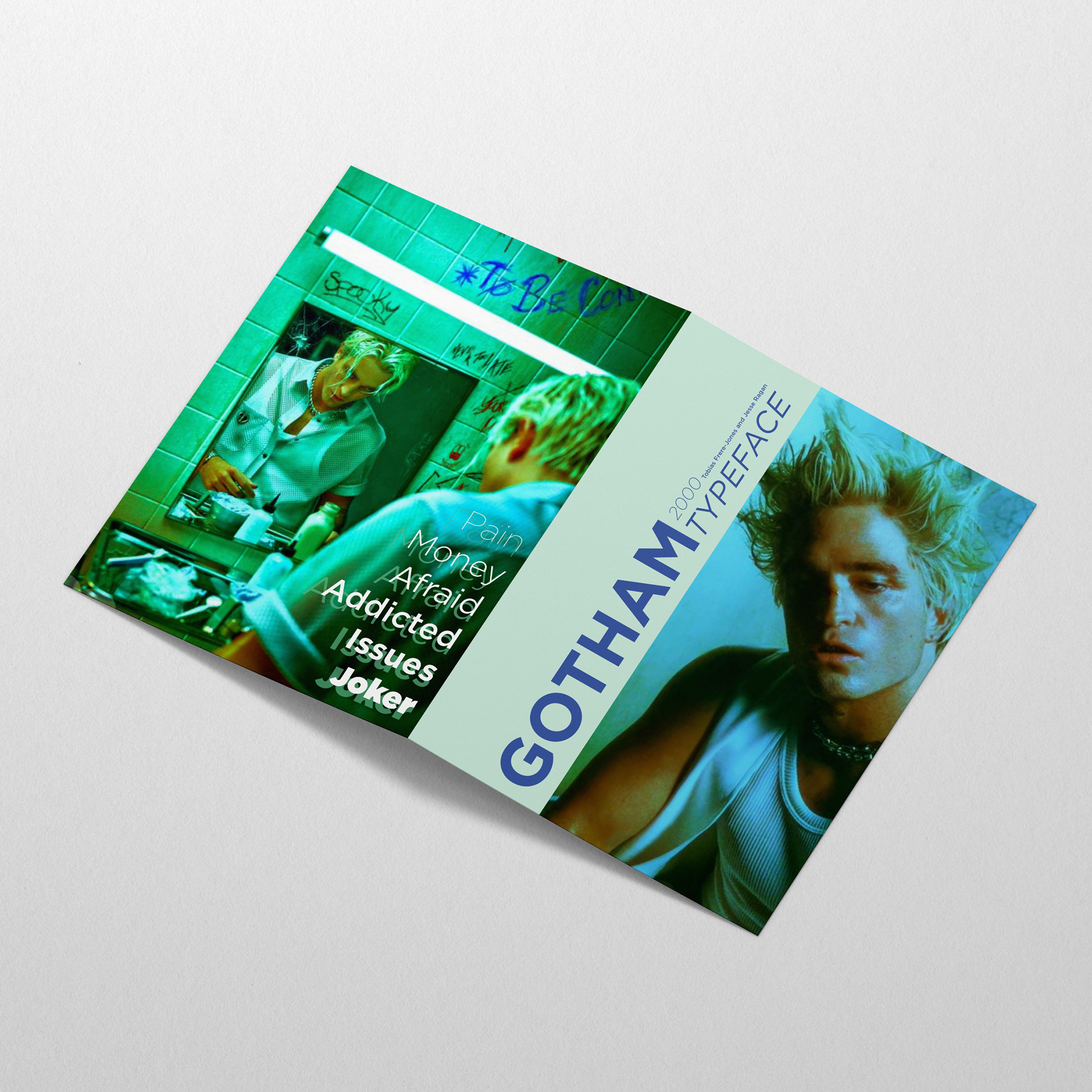
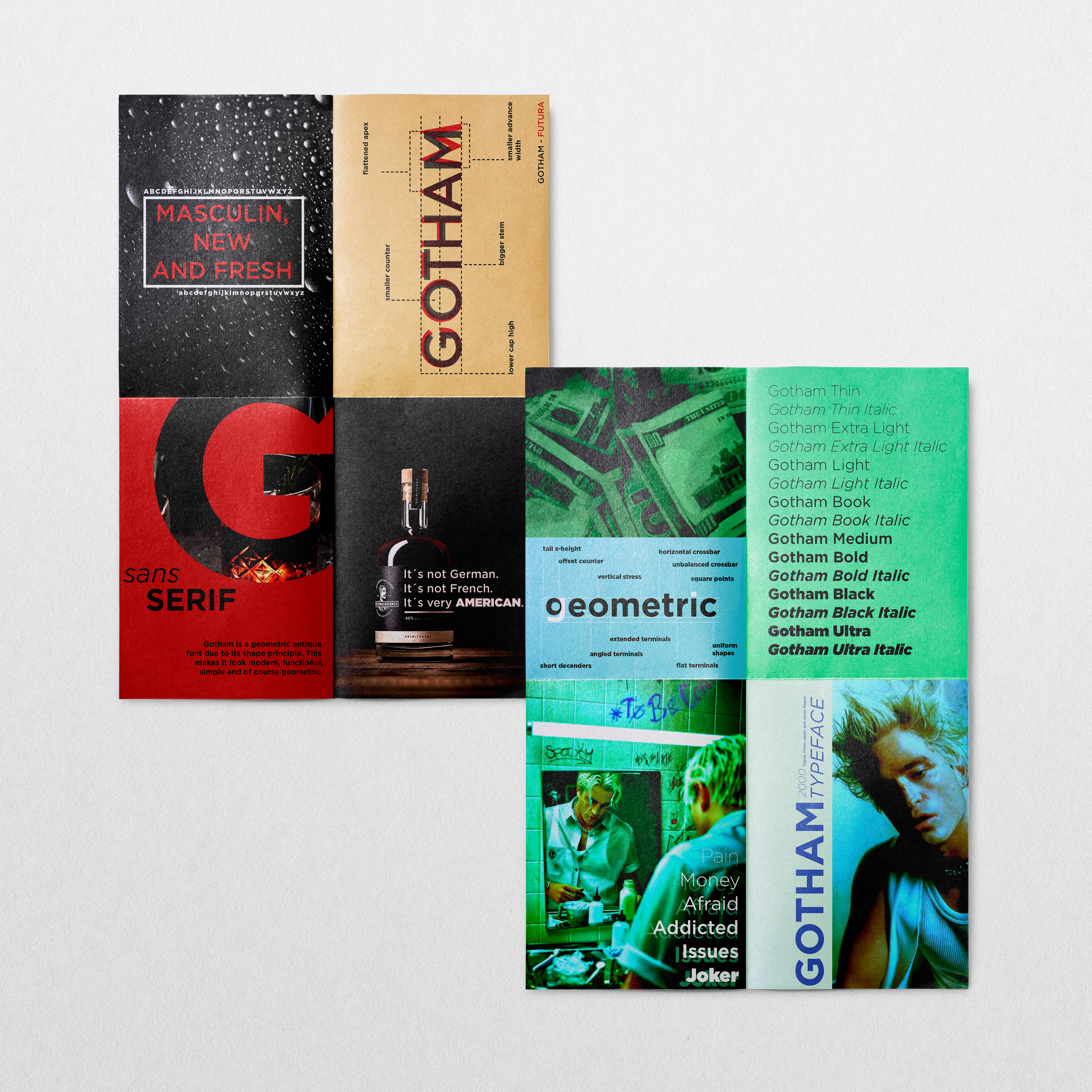
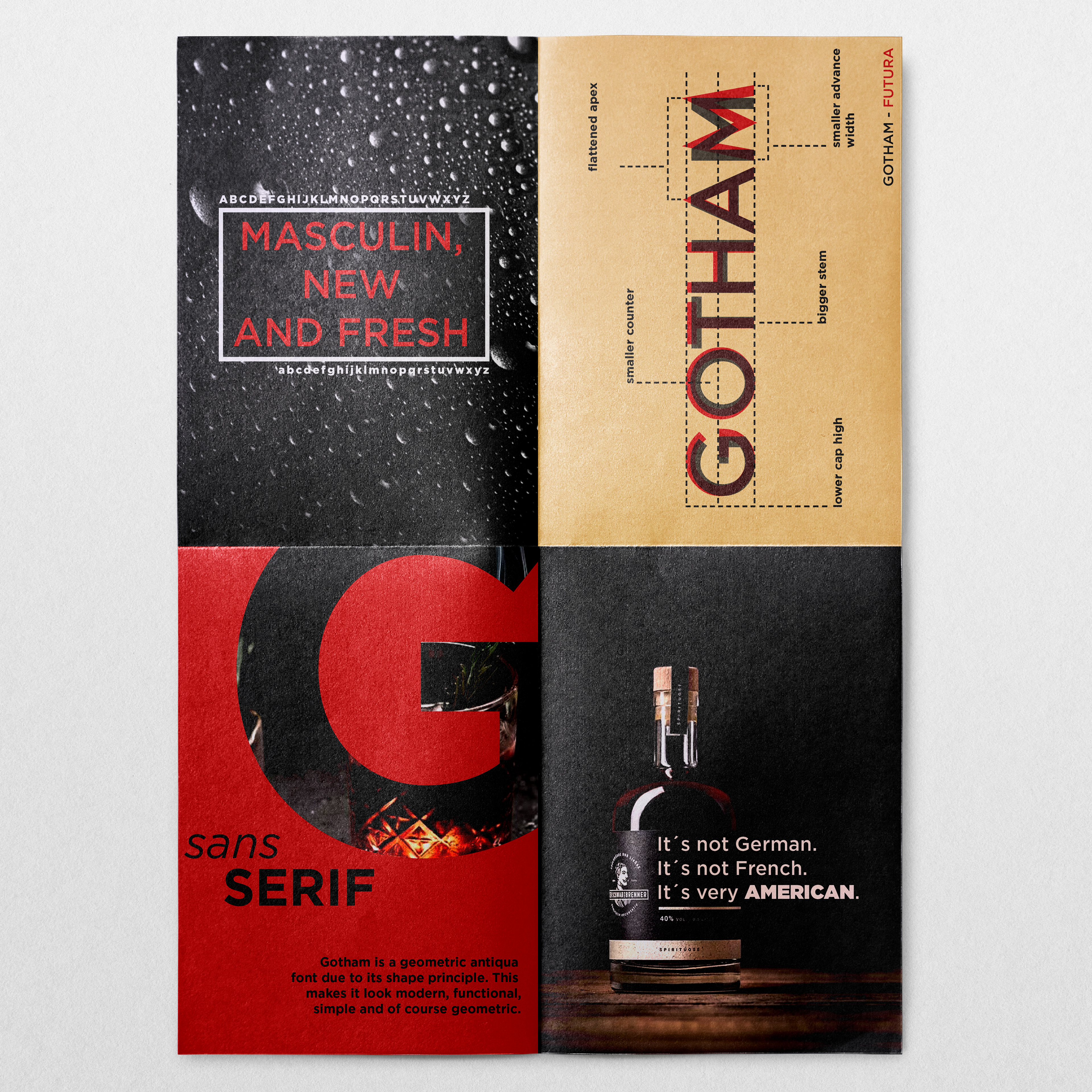
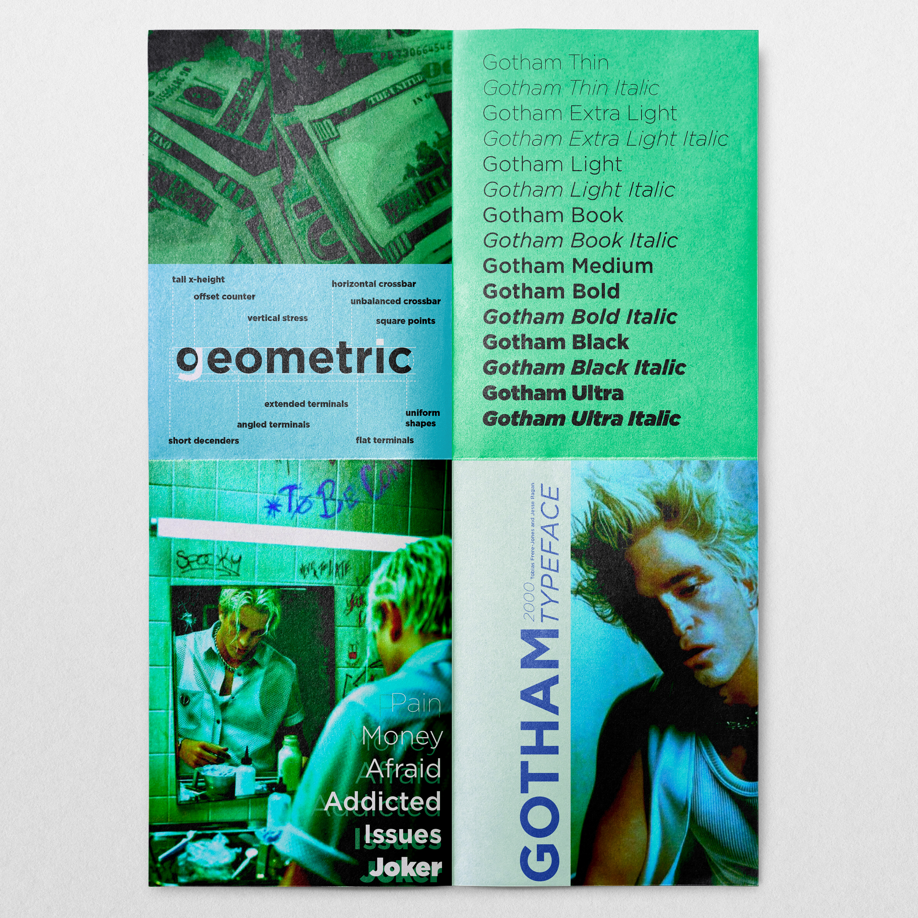
Gotham is more than just a typeface; it is a versatile tool that plays a significant role in the world of design. I have captured a small part of its versatility in this folder, along with my fellow student, Joan Leonie Prange. These two approaches not only showcase the structure and formalities of the typeface but also illustrate how 'Gotham' can be used graphically.
The first approach is inspired by the fascinating cinematic world of Batman and the Joker. Here, we use Gotham to create a trippy, dark atmosphere that reflects the city of Gotham. Altered graphics and a psychedelic color scheme complement the typeface, creating a surreal and mysterious mood.
The second approach is masculine and focuses on strength and robustness. The clean lines and powerful presence of Gotham are combined with sharp, straight-edged graphics to create a masculine aesthetic that immediately catches the eye.
Both approaches demonstrate the versatility and adaptability of Gotham in various design contexts, and their differences create a strong and distinctive contrast.
A project from 2022.
